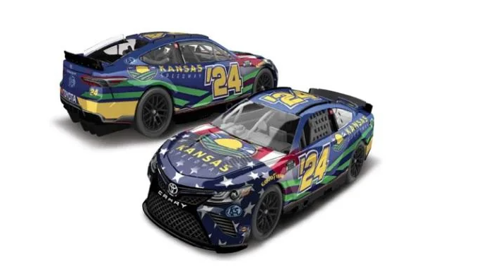
The newest NASCAR track logo may have been leaked. Reddit user Alarming_Dream_7837 called attention to a leaked Kansas Speedway 1:64 program diecast, featuring a brand new Kansas Speedway logo. Is another NASCAR track getting a new logo?
Back in November, Richmond Raceway changed its logo to a design similar to its’ sister tracks of Phoenix, Homestead-Miami, and Michigan. Kansas Speedway’s potentially new logo looks to take the same design cues, and fans have been at best split and at worst antagonistic towards the new design.
The philosophy behind this seems to be ISC and NASCAR rebranding their logos to be as similar as they can be. SMI does this with its race tracks and the iconic Speedway Motorsports globe.
It all comes down to uniformity. When a fan looks at the logo of Bristol Motor Speedway, Charlotte, or Las Vegas, they instantly think of “SMI”, because of the logo. It seems NASCAR is trying to do this with ISC properties.
In recent years, every NASCAR-owned track had its own unique logo. As a result, it was impossible to tell to the naked eye that each track was owned by the same company. They all looked and felt independent based on their own unique branding.
However, the drawback to this is that every track logo looks and feels either the same or similar. Each track has a hard time standing out on its’ own, and it just feels like another NASCAR track. Now, in fairness, using the track outline, different colors, and a design inside the track outline helps keep the logos somewhat unique. Here are some examples below.

Either way, fans are not fully receptive to the potential new Kansas Speedway logo. Maybe that could change as time goes on, but, who knows?
The fans were not all big on the logo, or even the Kansas Speedway car that was teased. Some, however, do like the new logo. Here is some of what the fans had to say.
Limp_Zookeepergame67 says the minimalist look of the 2020s is “Not fair”.
Comment
byu/Alarming_Dream_7837 from discussion
inNASCAR
BabycakesMurphy likes the way the new logos look.
Comment
byu/Alarming_Dream_7837 from discussion
inNASCAR
tylerscott5 notices a pattern.
Comment
byu/Alarming_Dream_7837 from discussion
inNASCAR
RBF48 highlighted that Kansas Speedway might be getting a new logo, but, that design is much harder to see than Kansas Speedway’s
Comment
byu/Alarming_Dream_7837 from discussion
inNASCAR
Same-Competition1806 calls the new logos “Bland”.
Comment
byu/Alarming_Dream_7837 from discussion
inNASCAR
Clippo_V2 hopes Kansas Speedway will have some old merchandise available during the spring race weekend.
Comment
byu/Alarming_Dream_7837 from discussion
inNASCAR
rcblasi11 says this may not be a new logo.
Comment
byu/Alarming_Dream_7837 from discussion
inNASCAR
Beerguy2727 says the new logo looks “Sharp”.
Comment
byu/Alarming_Dream_7837 from discussion
inNASCAR
tylerscott5 is happy Kansas did away with the yellow and blue logos.
Comment
byu/Alarming_Dream_7837 from discussion
inNASCAR
What do you think of this potentially new Kansas Speedway logo? What do you think of the recent changes to ISC’s track logos?