Richmond Raceway unveiled a brand-new logo on Wednesday, and fans are not sold on it. Plenty of fans on social media panned the logo for a variety of reasons. However, there is logic that is behind the design choices of the Richmond Raceway logo, here is a breakdown of some fan thoughts on the logo.

When the logo was first unveiled, fans quickly noted that this logo looked very similar to other track logos seen in recent years. Other NASCAR-owned tracks including Phoenix Raceway, Homestead-Miami Speedway, and Michigan International Speedway have all rebranded with the same general logo design. Sam Romshek noted this on Twitter.

It has the same general design cues as Phoenix, Homestead-Miami, and Michigan. This could be a part of an overall rebranding with NASCAR-owned race tracks. SMI-owned race tracks, for example, mostly have the same general logo with the track text next to it.
The benefit of this is that it better associates sister tracks with each other. Rather than tracks looking like separate entities, it’s easy to see looking at the current SMI track logos and the current logos of the four NASCAR-owned tracks that they are all partnered with each other. Previously, all ISC track logos looked very different, and, to the naked eye, it did not look like the tracks were associated with each other.
However, fans have offered a counter-example with SMI’s rebranding of Nashville Superspeedway. OK_suggestion_6092 on Reddit showed how SMI stepped away from their general template for the Nashville logo. They incorporated the guitar head, the track shape, and the SMI color and logo branding.
Comment
byu/kk5fan97 from discussion
inNASCAR
This shows that there are ways that tracks can get creative with their logos while also maintaining the brands of their parent companies. The designs in the track outline on the NASCAR-owned track logos show an attempt at that to some extent, but, fans still believe that the logo is not original enough.
Many fans just outright think that the logo is ugly. Now, this is tougher to analyze because beauty is in the eye of the beholder, but, what did the fans have to say?
Level1Lizard says he is tired of the “minimalist trend”, and he prefers the logos of the 2000s.
Comment
byu/kk5fan97 from discussion
inNASCAR
Enough-ad-3111 is concerned about other ISC tracks, Daytona and Talladega losing their iconic logos.
Comment
byu/kk5fan97 from discussion
inNASCAR
HelfastEddie was one of many who suggested that fixing the racing product should be higher up on the priority list than something like this.
Comment
byu/kk5fan97 from discussion
inNASCAR
epzik8 was one of a few who did like the logo for how it was sleek and straightforward.
Comment
byu/kk5fan97 from discussion
inNASCAR
Adam wants Richmond to fire whoever their marketing person is.

Ryan McAllister is one who likes the similar-looking logo.

Craig White is not a fan.

MT does not like that Richmond keeps rebranding.

The minimalistic logo definitely has its’ haters, but, a few like it as well. Regardless, this does not have any impact on the racing product at Richmond Raceway, which is the thing fans are most passionate about anyway. Regardless, this logo is not a total crowd-pleaser.

by Kauy Ostlien
NASCAR President Steve O’Donnell claims that he feels NASCAR “got a little lazy” in its attempts to keep growing the sport during a recent interview.
.@NASCAR prez Steve O'Donnell on trying to grow the series: "When I started at NASCAR, we were chasing IndyCar, and the goal was, 'If we can just kind of surpass IndyCar…' and we did that, and I've told our employees, 'I think we all got a little lazy.'" https://t.co/7TOQgsGJYb
— Adam Stern (@A_S12) February 23, 2026
NASCAR’s Steve O’Donnell is entering his first full season as NASCAR President, after taking over the post from former President Steve Phelps in March 2025.
O’Donnell took over his post during a turbulent time in sports history, as schedule changes and car generations compounded fans’ growing issues with things such as the 2014 playoff system.
To add to his troubles, NASCAR was in the midst of a heated antitrust lawsuit with two of its teams, 23XI Racing and Front Row Motorsports, that was bound for court in late 2025.
Ultimately, NASCAR would manage to put a bow on most of its troubles before the start of the 2026 season, settling the lawsuit with the two teams, changing its points format, and expressing an openness to explore changes to its NASCAR Next Gen car, such as increased horsepower on short tracks and road courses.
This whirlwind of change is turning gears in the NASCAR fanbase, with many fans saying a lot of the reshuffling is just as good for the sport as putting things such as the lawsuit and playoffs in the rear-view mirror, a sentiment shared by O’Donnell.
During an interview with Sports Business Journal on Monday, the long-time NASCAR executive said, “This is the first year I can remember where we’re going into the season, just talking about racing and what’s great about NASCAR.”
This isn’t the only shared feeling between O’Donnell and NASCAR fans, as prior to that, he said he felt NASCAR had grown “a little lazy” after overtaking IndyCar as the top motorsport in America, something he has even told NASCAR employees.
“When I started at NASCAR, we were chasing IndyCar, and the goal was, if we can just kind of surpass IndyCar, and we did that, and, you know, I’ve told our employees, I think we all got a little lazy.” — Steve O’Donnell
While many fans would agree that NASCAR has turned around for the better, there is still work to be done, and in O’Donnell’s eyes, the sport is in a prime spot to grow.
“My job and all of our jobs is to bring the industry together and talk about, we got a pretty cool thing going here, and we can really grow it,” O’Donnell said.
NASCAR isn’t exactly setting lofty goals for itself in 2026, at least in public, but that doesn’t mean it doesn’t have the attention of its fanbase.
While the revived Chase format has drawn back some eyes, things like NASCAR’s “Hell Yeah” advertising campaign were the talk of the NASCAR community entering the 2026 Daytona 500.
That race also produced a finish that saw NBA legend, team owner, and former NASCAR lawsuit plaintiff, Michael Jordan, bring home another major race win on National TV with driver Tyler Reddick.
This race also saw a slight increase in viewership from the 2025 Daytona 500, one hurt by a major rain storm that blew in early in the race’s running.
Though TV ratings may not be skyrocketing, NASCAR has early momentum to make 2026 good enough to set a firm foundation for O’Donnell’s goals of growth, but maintaining that momentum will be another challenge in and of itself.
What do you think about this? Let us know your opinion on Discord or X. Don’t forget that you can also follow us on Instagram, Facebook, and YouTube.

by Kauy Ostlien
The NASCAR Truck Series breaks off from the main touring series schedule this weekend, but that doesn’t mean the O’Reilly Auto Parts and Cup Series aren’t racing. So, whether you are going to be at the track or home, what does the forecast look like for the race weekend in Austin, Texas?
Before the OAP Series Race (11:00 AM – 2:00 PM)
During the OAP Series Race (2:00 PM – 5:00 PM)
After the OAP Series Race (5:00 PM – 8:00 PM)
Before the Cup Series Race (11:00 AM – 2:00 PM)
During the Cup Series Race (2:00 PM – 5:00 PM)
After the Cup Series Race (5:00 PM – 8:00 PM)
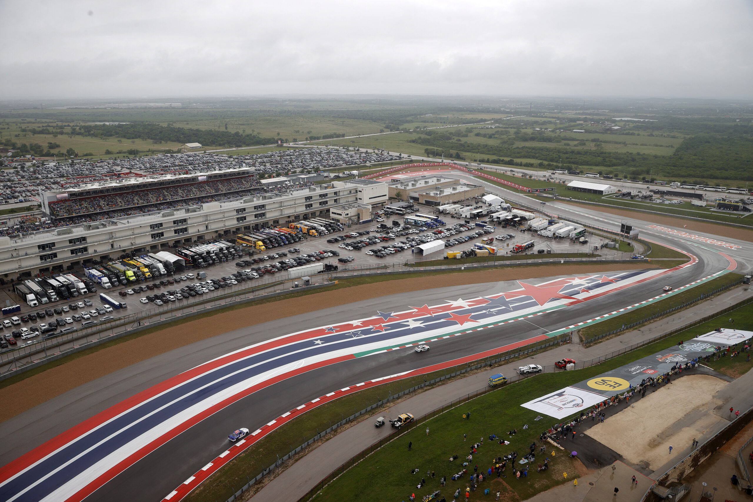
When the three NASCAR National Series rolled into Austin for COTA’s first NASCAR race weekend in 2021, no one could have guessed the chaos that lay in wait. A major rain shower did not prevent the series from racing that day, as, though it was still somewhat foreign at the time, NASCAR sent the Cup Series out in the rain for a chaotic race, ultimately won by Chase Elliott.
Note: This article will be updated with a more accurate and detailed forecast as the race weekend nears.

by Kauy Ostlien
After back-to-back drafting tracks, NASCAR’s three National Series split ways as the O’Reilly Auto Parts and Cup Series head for Circuit of the Americas, and the Truck Series makes its debut at the Grand Prix of St. Petersburg.
This information will be available when NASCAR releases it on Monday afternoon.
Note: This article will be updated as more information about the weekend comes out.